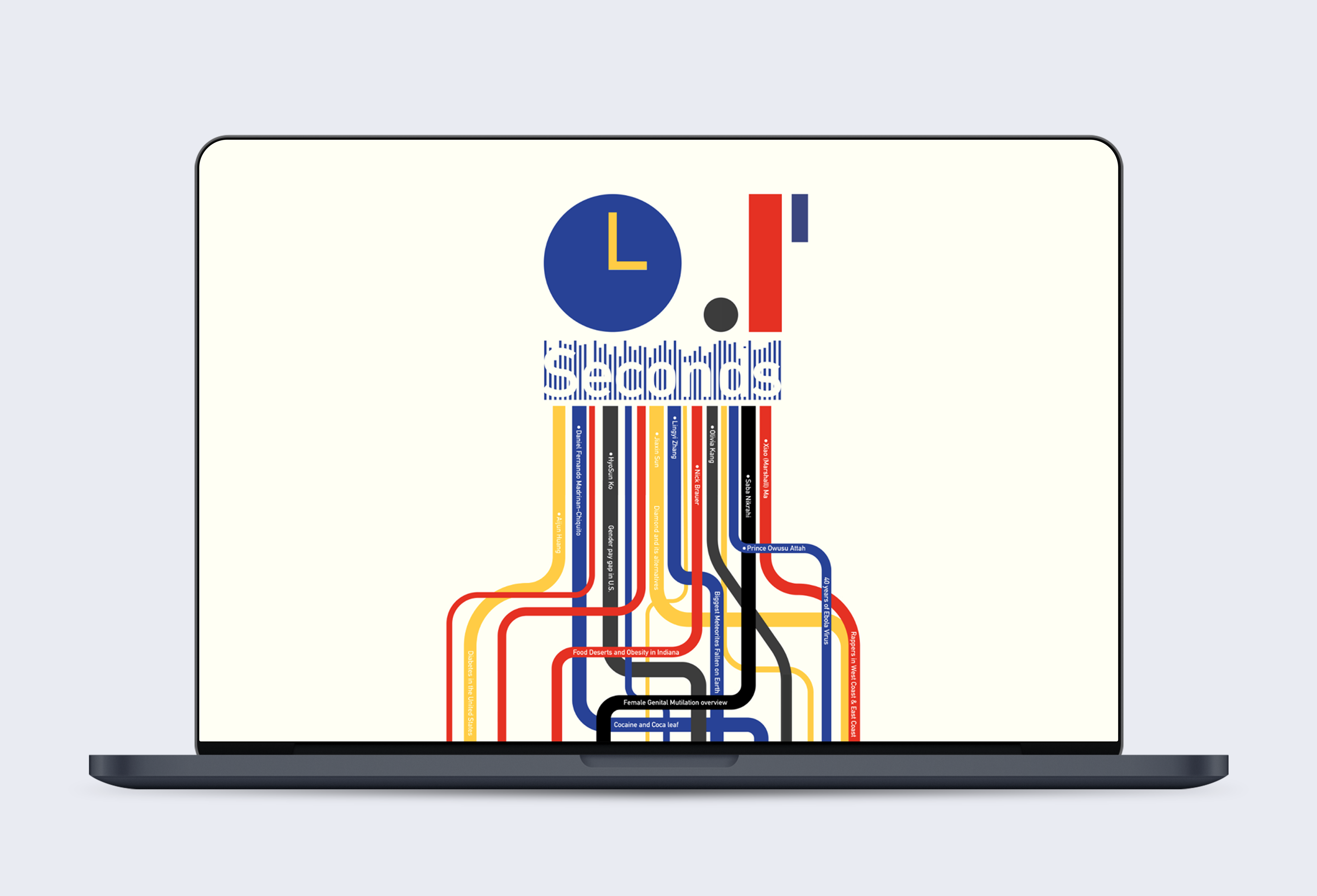
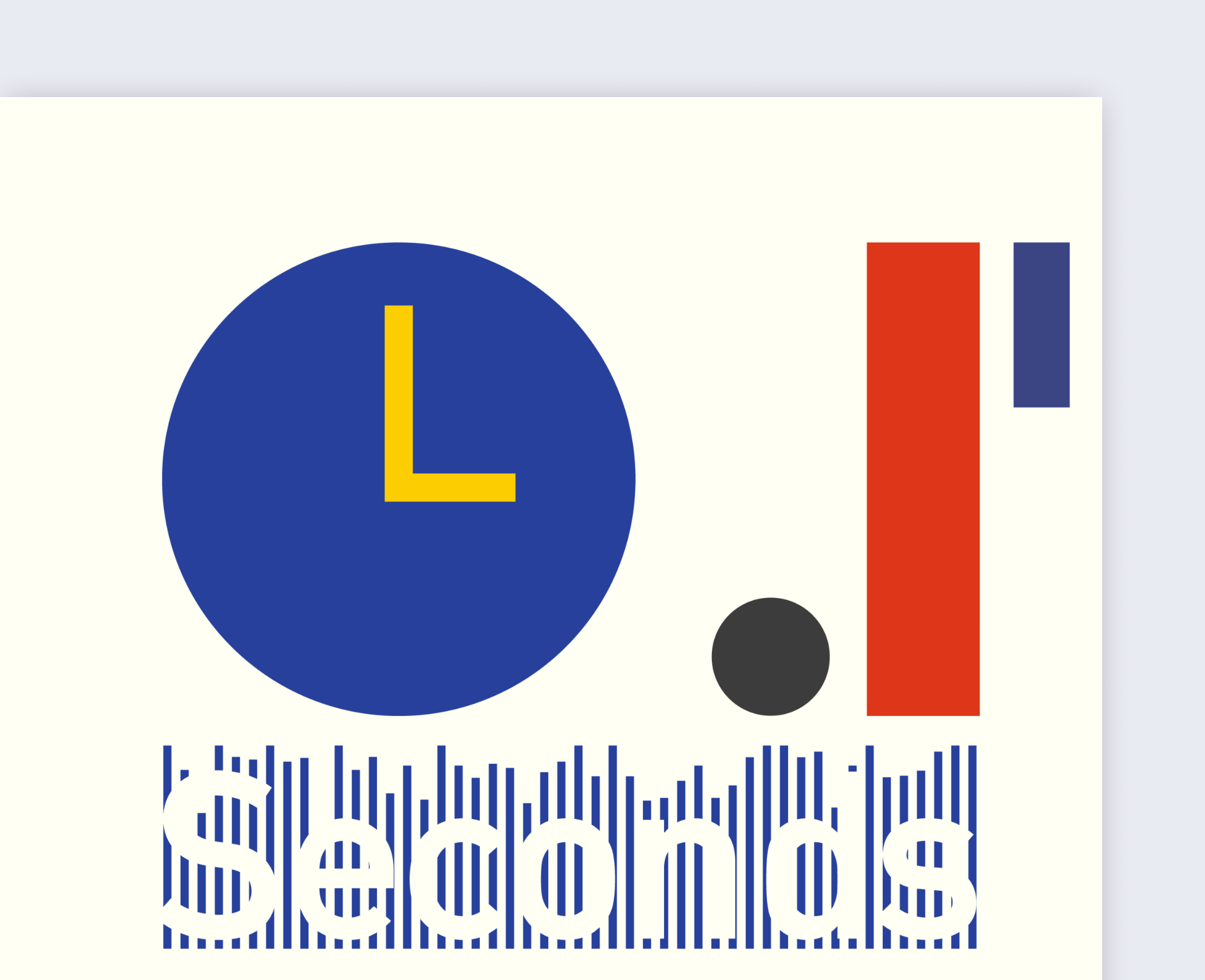
0.1 Seconds — Data Storytelling

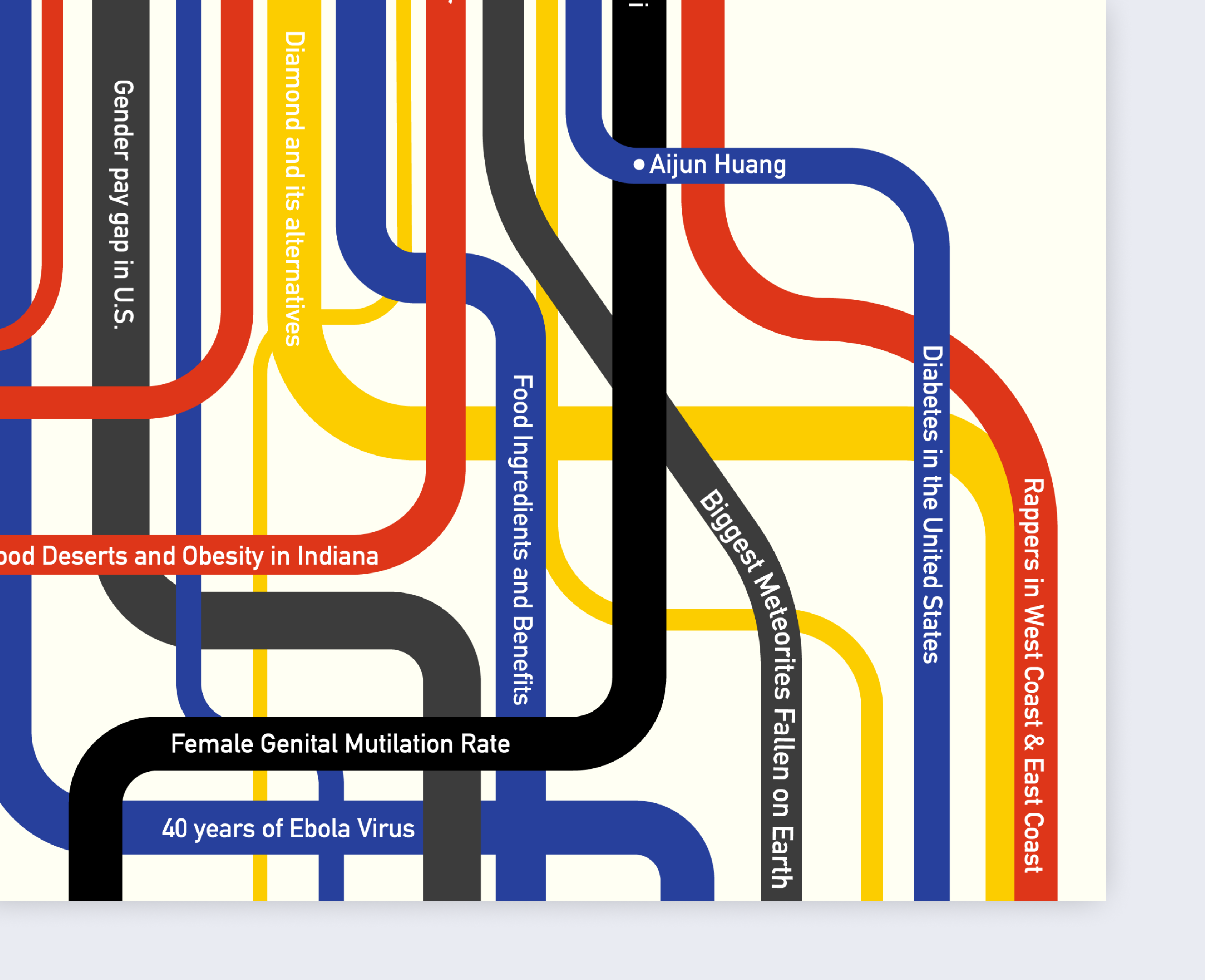
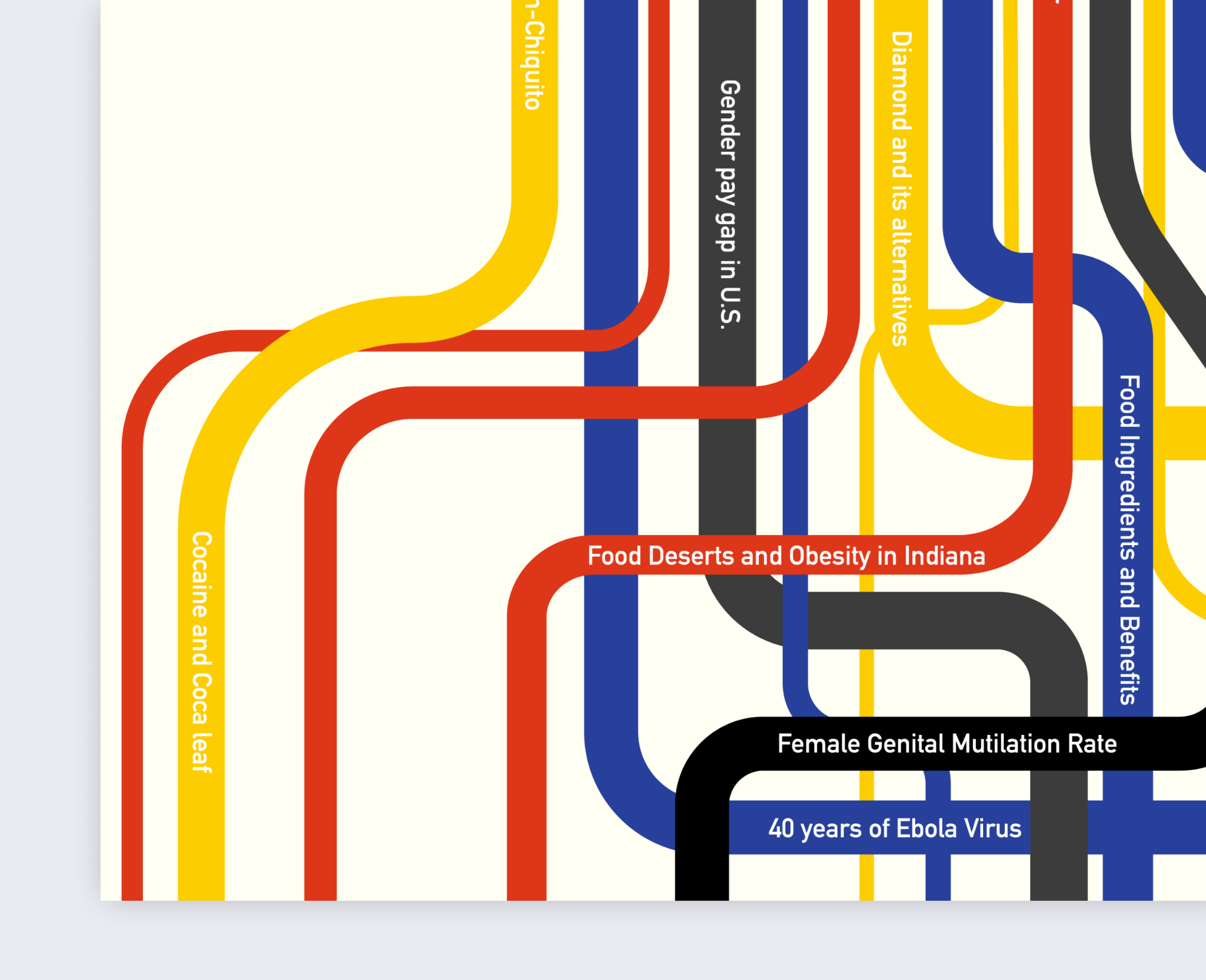
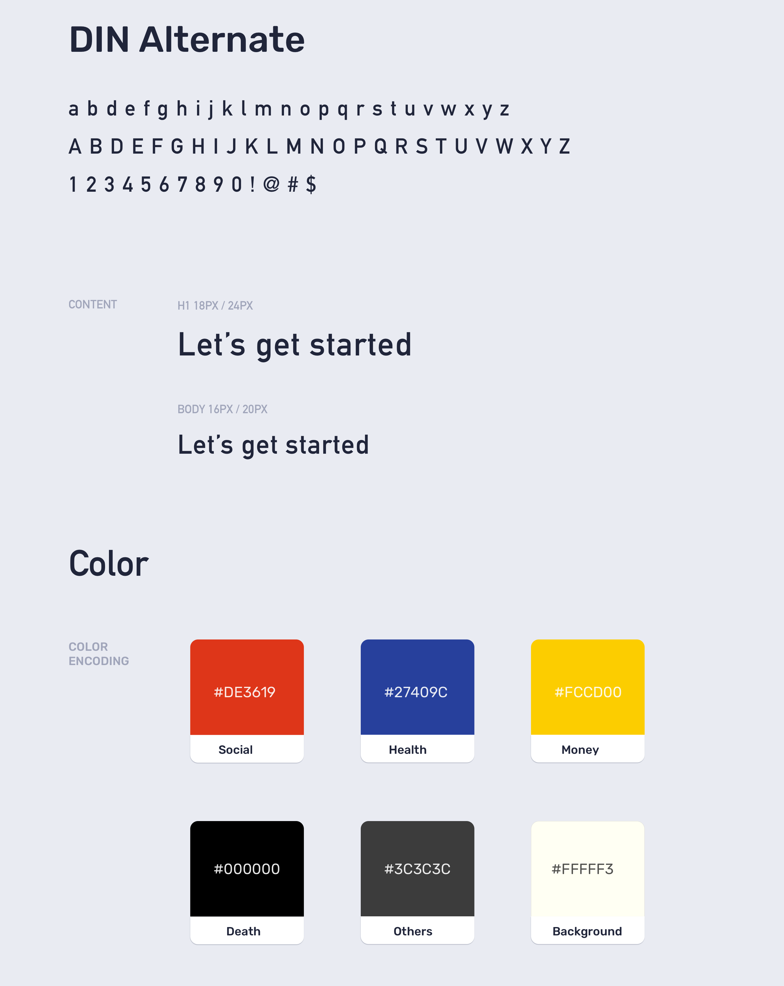
In 2018, my poster was selected as the best data visualization poster for Purdue University Data Visualization Exhibition. This data Vis was developed out of the event theme and the various works presented to be exhibited for the event. In the poster the ‘0.1 seconds’ which the event theme, represents the amount of time it should take for a person to read an effective data vis, the multi-colored lines also show the title of each exhibit, and the colors are inspired by the social context that each work talks about; (social, health, money, and death).
Purdue DataVis Exhibition participant data
12hours (3days)
Context
The event's theme was dubbed “ 0.1 Seconds,” drawn from the idea that effective data visualization should take a viewer about 0.1 seconds to recognize and decide to engage with it. With this theme, I had the challenge to create a compelling data visualization that communicate this along with all the content being exhibited at the event.
The main design challenge was to tell a data vis story with themes from the event and the participants' stories while leveraging the contextual meaning of the main theme.
Visual Design
Analysis
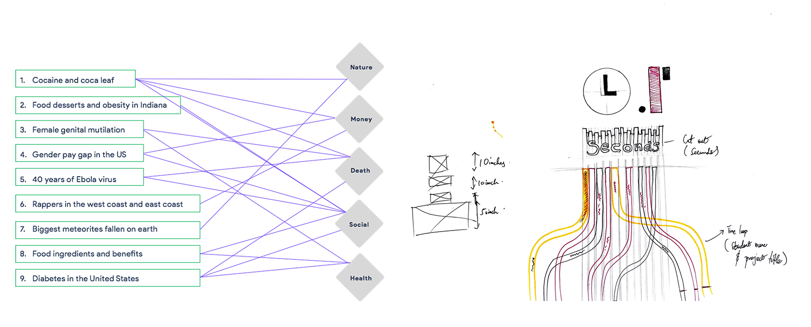
There were nine exhibitors, three or four of whom had similar topics and themes. I then mapped out the subject matter of all the topics to find the commonality within. Themes drawn from the topics were nature, money, death, social, and health-related. One challenge was that most of the topics overlapped one or more themes. After careful consideration, I chose to match topics with the most simple and identifiable theme so my target audience (university population) could make the inferences.
Visual Design
After mapping the themes with their themes, I was inspired by numerous line mapping visualizations to sketch up some concepts. The final version is seen above, after multiple modifications and feedback from colleagues. This version employs multiple lines of varying sizes. And colors with each representing a certain context.
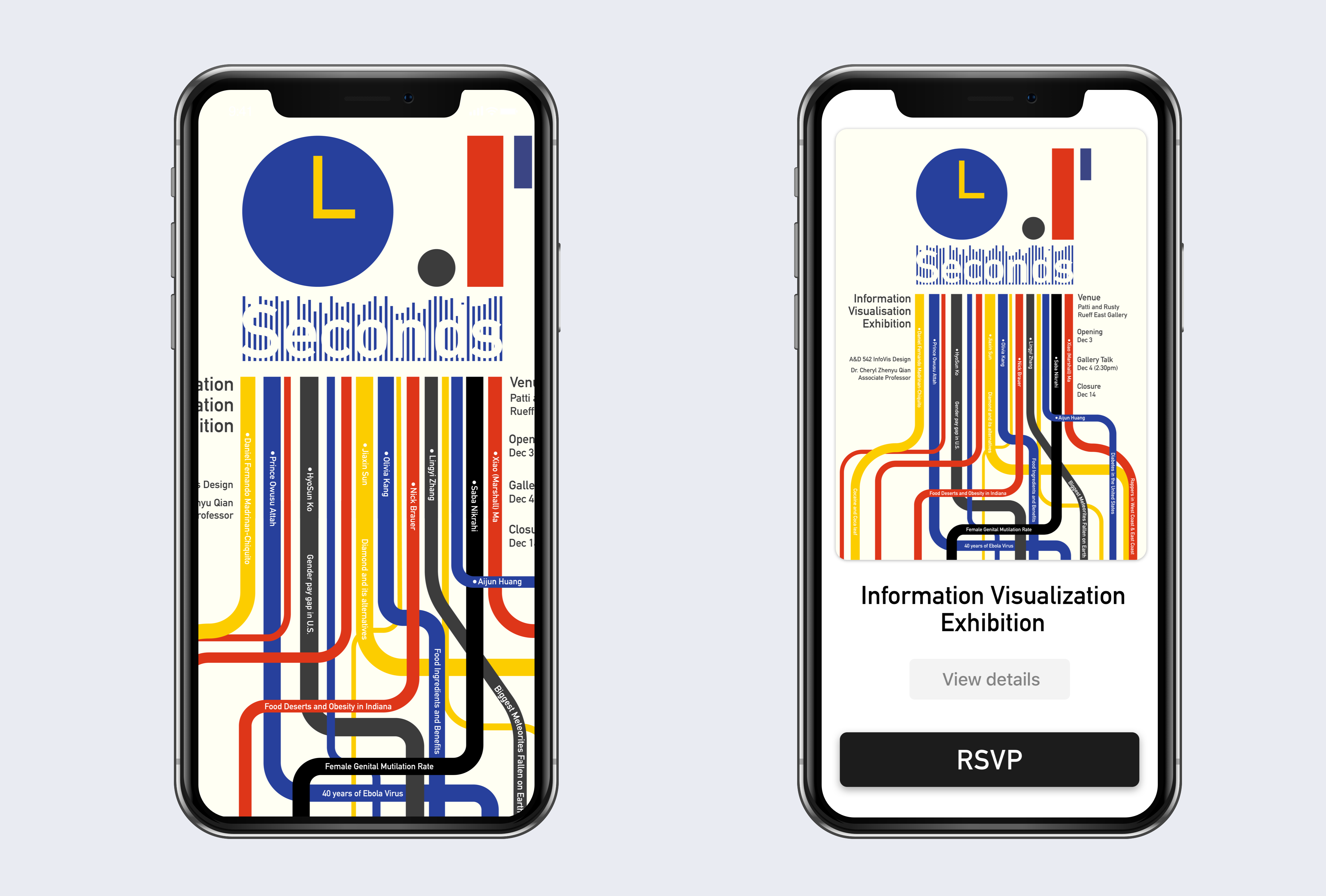
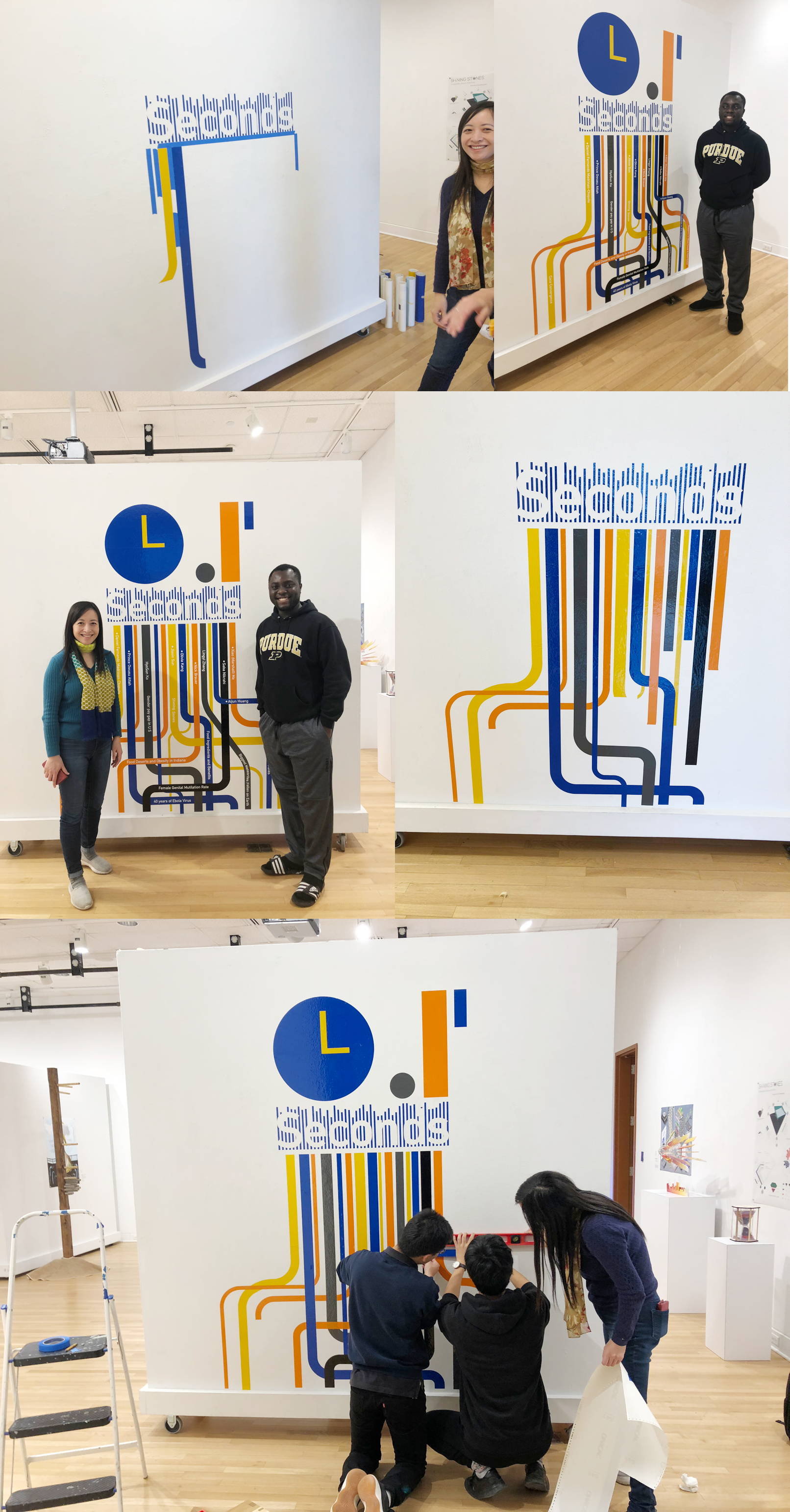
I was limited by the duration of three days for design and critique. My design output was also required to be in a standard print size document (PDF) 11.69 x 16.53 “. However, this design would go on to be expanded into a 50 x 50 in Vinyl print for the backdrop for the show.
This project was fun and fulfilling creatively. It helped me develop a lot of storytelling and narrative creation experience as well as how to break down visualizations into print.
Some key takeaways from this project include:
1. Data visualization is fun and interesting when employed in environmental design
2. Data storytelling needs to be contextual to make sense to the target audience.
3. Simplicity is always the best
4. We can learn a lot about the impact of visualization when you print and feel.